A good product isn't just something that you
can't resist pulling off the shelf. It's the satisfaction of a human
need, packaged into something that can be yours. The products in this
year's Innovation by Design Awards largely mark changing human
needs—from solving transportation as we face increasing urban density,
to giving the unseen digital bits floating around us a robotic face.
Congratulations to all of our finalists, and thanks to our judges for
their thoughtful critiques: Caroline Baumann, director at the Cooper
Hewitt National Design Museum; Carl Bass, CEO of Autodesk, and Jonas
Damon, executive creative director at Frog Design. Finally, a sincere
thank you to everyone who entered and supported Fast Company’s commitment to elevating the design profession.
(If you're looking for more inspiring work, don't forget to check out the finalists in our other categories: Winners, 3D-Printing, City Solutions, Data Viz, Experience, Experimental, Fashion, Graphic Design, Health, Mobile Apps, Product Design, Smart Home, Social Good, Students, Web Design.)
Firm: Vanmoof and Spinlister
Spinlister is a bike-sharing app with no hub or owners to go through;
instead, users can lock and unlock computerized Vanmoof bikes from the
app via Bluetooth. Bike rentals become untethered from Divvy stations,
and the world of bikes becomes available as one rentable network of
vehicles.
Creators: Robert Brunner, Steve Sangik Lee, Geoff Dowd Firm: Ammunition Client: Adobe
Adobe Ink, a precision pen for iPad, and Slide, a digital ruler, are
Adobe’s first forays into hardware and work seamlessly with their
drawing apps. They add a level of tactility to the digital UI never seen
before in mainstream tablets.
Creators: Mike Butera, Jacob Gordon, John Sundermeyer, Ryan Wrenn Firm: Artiphon
Imagine the keytar of the modern age. This portable instrument can
play almost any musical sound imaginable, is customizable for many skill
levels and connects directly to smartphones, tablets and computers.
Plus, its UX allows a variety of classic inputs from analog music
history—like strumming, bowing, tapping, and sliding.
Creators: Google Cardboard Team
Google’s low-cost virtual reality viewer uses a cardboard box and a
smartphone to let users interact with movies, go on landmark tours, and
examine 3-D objects. Its design isn't just cheap; it lowers the bar to
experimenting in virtual reality, and makes it feasible to develop VR
apps for a smartphone.
Creators: Philip Krim, Jeff Chapin, Luke Sherwin, Neil Parikh, Gabe Flateman Firm: Casper
The mattress aims to be comfortable for all sleepers, layering three
types of foam, then wrapping the mattress core in soft textiles. It
also challenges traditional, brick-and-mortar mattress sales. It ships
straight to customers in sleek packages with a 100-day free trial.
Creators: Eric Norman, Jim Reich, John Yu, Karen Kaushansky, Joseph Morin Firm: Palate Home
Cinder is a kitchen appliance that allows home cooks to sear food at
high, precise temperatures—with all the automation of a 550-degree sous
vide machine. A virtual thermometer algorithm infers the temperature of
the food as it cooks, measuring doneness in real time.
Creator:Dyson
After six years and $12 million in R&D, Dyson created this
no-filter vacuum cleaner uses small cyclones to generate higher
centrifugal forces that never lose suction. Inside, vibrating fabric
tips—shaking 350 times a second—prevent tiny particles of dust from
clogging the machine and eliminating the need for filters that might
wear out over time.
Creators: Scot Herbst, Will Hunter, Ayub Khattak, Clint Sever Firm: Herbst Produkt
A simple box that stands but 3-inches tall, Cue is a device that can
track inflammation, vitamin D, fertility, influenza, and testosterone in
minutes at home using a saliva, blood or nasal swab, and then import
the data into a smartphone app.
Firm: Eero
Eero re-imagines Wi-Fi routers and bridges as an expandable series of
devices that spread across your home to form a dynamic mesh network,
guaranteeing coverage without specialty hardware and complicated setups.
Firm: Pauline Deltour and Lexon
Designed to reimagine musical hardware as unabashedly feminine, Fine
Speaker is a delicately grooved speaker built with a twisting function
for turning on and off, modeled after lipstick.
Firm: Pensa Client: GoTenna
GoTenna pairs with a smartphone, then it uses VHF signals—like
traditional two-way radios—to allow users to text and share locations
even when they have no service, be that in an emergency situation or in a
crowded stadium environment.
Creator: Made by Many
The iPhone-connected toy teaches children to code by letting them
program games into a sensor and light-loaded ball that can respond to
being thrown, shaken, dropped, or kept still.
Creators: Dan Harden, Hiro Teranishi, Kyle Buzzard, Kailash Hiremath Firm: Whipsaw Client: Highfive
This black cube embedded in an aluminum wing is really a hi-fi, HD
videoconferencing system designed for affordability and daily use in
businesses. Rather than remotes or buttons, it's controlled via a
laptop, wirelessly.
Creators: Chris Miksovsky, Clint Slone, Evelyne Chaubert, Charlie Nghiem, Jonathan Downing, Bob Lane, Jeff Salazar, Tiffany Ninmer Firm: LUNAR Client: humangear
A compact, efficient set of utensils including forks, spoons and
knives with a bottle opener and toothpick built in, made for camping or
just an urban commute.
Creators: Diana Africano Clark, Anders Arnqvist, Pernilla Danielsson, Laura Almenberg, Fernanda Barbato, Jingjing Yao, Fredric Ghatan Firm: Veryday Client: Ikea
While wireless charging has been around for nearly a decade, Ikea
could be the first to take the idea mainstream, as they released a small
wireless charging pad that can be installed into any kind of furniture.
Firm: Form Us With Love Client: Ikea
Janinge is a line of utilitarian, multi-purpose, and stackable
chairs, designed to be suitable for outdoor use, yet keep the price down
to a mere €39 per unit.
Creator: Cynthia Breazeal, et al. Firm: Jibo
Jibo is a household assistant that can also be a messenger,
photographer, storyteller, and companion, designed with the face of an
AI, and enchantingly fluid motions of a sci-fi robot.
Creators: Adam Bowen, James Monsees, Krista Hunter, Steven Christensen, Cole Hatton, Ari Atkins, Chenyue Xing Firm: Pax Labs
Juul’s e-cigarette is designed to mimic the aesthetic and flavor of
real cigarettes, by more precisely mimicking a the state of nicotine
when delivered by a cigarette, and delivering more vapor in the process.
Creator: Leatherman Tool Group
This stainless steel bracelet is actually a Swiss Army Knife for the
modern man. Its links hide 29 tools for various purposes, from
screwdrivers to bottle openers.
Creators: Gregoire Vandenbussche, Ammunition, Lyft Firm: Ammunition Client: Lyft
In a powerful, physical rebranding, Lyft redesigned their infamous
clowny mustache into a glowing, USB-chargeable, portable product for
drivers to attract customers.
Creator: Navdy
Navdy attaches to the dashboard and projects a HUD of driver
information like maps onto the windshield so drivers can keep their eyes
on the road, retrofitting old cars with the latest in interface
technology.
Creator: Tangible Play
Osmo is an iPad peripheral that mirrors the camera lens toward a
table, and allows kids to combine digital app-based games with real
physical objects like blocks, markers and coloring sheets.
Creators: Tactus Technology with Ammunition and Alloy
Phorm is an iPad Mini case with an invisible, mechanical keyboard
built in. Using microfluidic technology, it pops up from a flat
touchscreen, giving you a tactile keyboard in the process.
Creator: Fiskars
The pruning tools are ingeniously designed with a rotating gear that
provides a boost of power in the middle of the cut, where branches are
thickest. Additionally, the latest models are easier on the hands, as
their handles have been modified with a more oval shape and a gel skin
that prevents blisters.
Creators: Yves Béhar, Noah Murphy-Reinhertz, Qin Li, Naoya Edahiro, Logan Ray, Andrea Small Firm: FuseProject Client: Herman Miller
This modular "social chair" allows for flexibility in forming
different configurations, whether work needs to be solitary or
team-based. It can be linked into a shared bench system, and additional
modular paneling can make the public spaces private.
Creators: Sabi by Urbio and MAP Project Office Firm: Sabi by Urbio
What started as an ethnographic project to develop bathroom figures
for older people became this 13-item bath collection allows for
customization and adaptability in bathroom storage. Its centerpiece is a
circular ring that can be used in place of a stabilization bar.
Creators: Dr. Marcus Weller, Mitchell Weller Firm: Skully
This smart motorcycle helmet features 360 degree camera, GPS
navigation, and telemetry information inside a HUD so that drivers can
keep their eyes off the road.
Creator: Samsung
Without real flames or glowing orange heating elements, the magic of
magnetic induction is invisible by nature. So this cooktop deploys LEDs
to simulate flames when the induction plates are on, signaling that a
hot pot is on the stove.
[subhed]Creators:[/b] 3D Robotics with Astro Studios
The Solo smart drone is designed first and foremost with drone
photographers in mind, with a controller featuring a first person view
of the GoPro camera on board, or any other live stream of HD video.
Additionally, it can automatically land and takeoff with GPS assist, and
a "pause" button will freeze the drone in midair.
Creators: Scot Herbst, Alex Vilgertshofer, Sheila Dahlgren, Thiago Olson, Nick Bognar Firm: Herbst Produkt
Stratos consolidates credit, debit, loyalty, membership and gift
cards into one smart card, which features a dynamic magnetic stripe,
allowing it to transform itself into any card in your wallet.
Creators: Panos Panay, Brett Ostrum, Ralf Groene, Stevie Bathiche, Yi-Min Huang, Pavan Davuluri, Ricardo Lopez-Barquilla Client: Microsoft
A full 30% percent thinner than an 11-inch MacBook Air, Surface Pro 3
is a thin and light 2-in-1 laptop and tablet, with a "continuous
kickstand" allowing the device to tilt to any angle the user wants.
Creators: Procter & Gamble and Whirlpool
Built from 133,000 hours of R&D, Swash is an at-home clothing
care system that steams clothes—freshening them and smoothing wrinkles
in a mere 10 minutes, so that users don't have to run to the laundry or
dry cleaner as much.
Creators: Lars Larsen, Johannes Becker Firms: AIAIAI and Kilo Design Client: AIAIAI
These headphones can be configured 360 different ways—with four
different speaker units, five different earpads, three different
headbands, and six different cords—each of which easily swaps out if you
decide to buy new parts, or want to use the headphones for a different
context.
Creators: Clement Gallois, Oliver Mueller, John Mabry, Michael Charles, Kay Kim, Roger Jackson Firms: Teague & Sizemore Bicycle
Deny is designed to be the ultimate bike for urban environments,
complete with auto-shifting gears, electric pedal-assist, smart reactive
lighting, a fender that pulls water from the tire, and an integrated
handlebar lock.
Creator: Rockwell Group Client: Virgin Hotels
Realizing that many people actually work from their hotel beds, the
Lounge Bed was optimized for sleeping and sitting—with a padded
headboard offering lumbar support, and a bucket seat in the corner.
At a time when the United States is getting ready
to elect its first female president, the notion of the classic Disney
princess—a helpless beauty patiently awaiting her prince—seems
hopelessly outdated.
Disney seems to realize as much (or is at least willing to pander to
critics). To fight accusations of contributing to body image problems
among young girls and studies showing that the Disney Princess brand encourages gender stereotypes, Disney has issued
a 10-point guide for the modern princess—and none of them has to do
with tiaras or happily ever afters. The Disney Princess is getting a
makeunder.
Kate Forrester
A $3 Billion Gamble
Disney's Princess franchise dates to the early 2000s, when a newly hired
executive named Andy Mooney noticed that young girls were dressing up
as princesses—not Disney-specific royals, but generic ones—to attend a
Disney on Ice show. Soon after, with no focus group testing and little
marketing to speak of, the princess franchise launched. It consisted of
coordinated products for a starting group of nine characters and has
grown to become one of the company's most lucrative enterprises—estimates put its revenue at more than $3 billion globally (compared to
$300 million in 2001). The Princess franchise includes classic
characters like Snow White and Cinderella as well as contemporary
characters like Mulan and Merida.
Rose Blake
The Modern Princess
This new list of a modern princess's aspirations focuses on inner
strength and morality rather than tiaras. Commandments includes "be
honest," "don't judge a book by its cover," "try your best," and
"believe in yourself."
The company asked three British illustrators to turn the tenets into typographic posters that are free to print or pick up in Disney stores and come with instructions for framing and hanging.
Left to right: Rose Blake, Kate Moross, Kate Forrester.
It's an attempt to get into the rooms of little girls with a less
stereotypical message—though it's unclear how the principles will impact
Disney's products; the company continues to sell a multitude of pink-and-purple products that encourage domesticity and focus on physical appearance. Illustrating The New Principles
"It seems like a really nice idea to visually show them that it’s not
all about pretty dresses and handsome princes," says the illustrator Kate Forrester.
She says that she deliberately tried to avoid any suggestion of what
she called "the long blonde hair stereotype," focusing instead on fun
lettering that would appeal to any young girl (or boy).
Another illustrator, Kate Moross,
said she tried to include as many details as she could, because that's
what she'd always enjoyed looking at posters and art as a kid. "I like
to think that anyone big or small could relate to them and they're not
just for girls but for boys too, and everyone in between," says Moross.
She didn't identify with the Disney princesses growing up, but thinks
that this project is moving them in a better direction. Rose Blake,
the third illustrator who contributed to the project, thought the new
"princess principles" were spot on—she was pleased that "marry a prince"
wasn't on the list. She did have one request for Disney. "I would like
to see [a princess] with a bob haircut, like me," she says. "When I was a
kid I wasn’t interested in Disney princesses at all. I liked Robin
Hood, The Rescuers, the tomboy thing. It’d be cool to have a real tomboy
one, like the girl in Stranger Things."
Kate Moross
A Business Case
With more and more pushback against the blue and pink aisles
in toy stores and growing awareness of how toys can impact a child's
development, Disney has every incentive to adapt the Princess franchise
to the times. It already has proof that it can market a strong female
protagonist in Elsa, the complex heroine of Frozen, which has raked in over $1 billion worldwide. Meanwhile, another classic toy brand, 57-seven-year-old Barbie, has struggled to modernize—and has suffered financially as a result. [All Images: via Disney]
6 minute read
Pandora Rebrands For The First Time In 11 Years
The music service overhauls its icon and logo to reflect ambitious plans ahead.
Julie Scelzo’s first project at Pandora could
hardly have been more nerve-wracking. As the company’s new executive
creative director, the former Facebook creative strategist found herself
on a team tasked with an absurdly ambitious goal: Overhaul Pandora’s
brand, right in the midst of the busiest and most transformative year since the company’s pivot to streaming music 12 years ago.
Not only was Pandora morphing from an internet radio app into an
on-demand music service a la Spotify, but it was doing so under a new
CEO: Pandora cofounder Tim Westergren, the closest thing a product or
brand can have to a biological father.
Last week, Scelzo got a late night email from Westergren that set her nerves at ease. It contained only two words: "Fuck yes."
For Scelzo and Pandora VP of Design and Creative Tony Calzaretta,
Westergren’s candid sign-off meant that the project could soon be
wrapped up and unveiled to the public. That was good news for them,
because Pandora’s in-house designers have a ton more work ahead of them
as the service undergoes its most radical changes yet in the months to
come.
"With this revolution at Pandora happening, we wanted to do something
revolutionary, not just evolutionary, when it came to what it looked
like," says Scelzo. The company did refresh its logo three years ago, but only in the form of a subtle, typographic tweak. This time, they wanted to rethink things entirely. Dynamic Branding For A Company In Transition
Pandora’s new branding takes multiple forms. The first that most will
likely notice is its new mobile app icon. The new icon, which will start
showing up on users’ home screens today, sheds the dark blue, serifed
"P" that has long served as the symbol for Pandora in favor of a new
image: A fatter, sans serif "P" without a counter (typographic speak for
the hole in a letterform). For new or returning Pandora users, the
change may not even be noticeable. But for the millions of people who
have stuck with Pandora over the years, it’ll be hard to miss. This is
the first time that icon has changed since Pandora first arrived on the
iPhone in 2008.
Pandora's designers considered more than 1,000 versions of its new "P" logo before settling on the one they're unveiling today.
This new logo, which Scelzo says went through more than 1,000
iterations before being finalized, will also be anywhere else the
Pandora brand shows up: on a new animated splash screen that loads when
one launches the Pandora app, in marketing materials, and in the
real-world concert environments that Pandora is increasingly involved in
curating. And the branding will extend into new territory later this
year when Pandora is expected to formally announce its Spotify
competitor.
"This will help us transform everything we do," says Calzaretta, who
was originally hired as Pandora’s first product designer nearly 11 years
ago. Back then, Pandora took one form: A browser-based internet radio
service. It has since become a multi-platform music app that runs not
only on phones and tablets, but on a wide range of hardware from smart
speakers and television sets to cars. Throughout the years, as Pandora
has evolved, its branding has not. That is, until today. Capturing What Music Looks Like
Although the new "P" will appear everywhere in the same new,
custom-designed and counter-less typeface, it won’t always have the same
aesthetic. A major part of the new branding initiative was the
development of a dynamic visual language that allows designers to
present Pandora’s brand in a range of visual styles, each one pulling
strains of influence from the very thing that Pandora is peddling to
consumers in the first place: music.
Hunkered down in what Calzaretta calls a "war room" inside Pandora’s
Oakland headquarters, a team of 12 designers from across disciplines
toiled away creating dozens of variations of the new Pandora branding
that each tried to answer, in its own way, one question: What does music look like?
"The truth is, music doesn’t look like one thing," says Scelzo. "It’s
pretty dynamic. It can be bold, it can be quiet. It can be colorful."
So, while doing their best to steer clear of visual cliches like play
buttons and imagery of vinyl records, the designers undertook a
weeks-long exercise that sought to think of visual branding the way
musicians think of songs. Just as music is made up of harmony, melody,
and rhythm, Pandora’s designers tried to use form, color, and pattern to
visualize what music might look like, all with the new, bulbous "P"
sitting square in the middle of the canvas.
To help crystallize their thinking, Calzaretta and Scelzo tapped a
resource that only Pandora could offer: a team of musicologists and
music curators that spend their days tagging millions of songs with
hundreds of musical attributes. This so-called Music Genone, which sits
at the heart of Pandora’s music discover algorithms, could also be mined
for descriptive insights into how to translate sounds into visuals.
"We definitely got into the geekier side of talking about the
visualization music," says Calzaretta. "We started digging deeper into
our own genome and talking about the musical trait of timbre, which
musicians refer to as the color of sound."
The end result, or at least the first iteration of it, can be seen in
a grid of 25 versions of the Pandora branding being unveiled today.
Each one is visually distinctive from the next, from the straightforward
(featuring the faces of musicians) to the more abstract (featuring
ambient textures or an organic hand-illustrated look). These images,
which vary widely in their color schemes, textures and overall
stylistic approach, were inspired in part by the MTV logos of the 1980s,
which often had different patterns and styles within the "M" of the
network’s iconic logo.
"There are still guardrails around a dynamic brand like this," says
Scelzo. For instance, they didn’t want these images to be too literal
(hence the lack of music notes and records) or too drab. One country
music-inspired mockup, for example, portrayed the logo branded in old
wood reminiscent of a Texas bar or a whiskey barrel. It was a decent
concept, but it lacked the musical-seeming sort of energy they were
aiming for.
"If we looked at something and you couldn’t hear music playing or it didn’t feel like sound, we threw it out," Scelzo says.
"Not Too Hipster, Not Too Country"
Some aspects of the process did prove controversial. In the crafting of
the new "P" logo and the accompanying "Pandora" word mark, the team made
a conscious effort to differentiate the brand even further from that of
the jewelry company by the same name. Concerns about confusion between
the two brands has been an issue internally for years. For that reason,
the new word mark uses a new, Bauhaus-inspired typeface with softer
lettering and spells the product’s name out in all lowercase (until now,
it was in all caps, like the jewelry company’s logo). Letting go of the
old logo was hard for some company veterans, but the team was
eventually able to make the case.
"Music should be welcoming," says Calzaretta. "We always talk about
Pandora being your friend that helps you listen to the music you love. I
didn’t feel like the [old] brand was doing that. It felt a little like a
financial institution or an online university."
Softening up the core logo and word mark was an important first step,
but in the end it was the multi-styled, music-inspired variations that
stood out most to Pandora’s executives, especially Westergren, himself a
former career musician.
"The way that the brand is dynamic got him really excited," says
Scelzo. "It doesn’t feel too hipster, doesn’t feel too country. It can
mean a lot of things to a lot of people."
In the mobile-first 21st century, apps have
become one of the most important elements of any product or brand. But
as the users of millions of crappy apps can attest, designing a good one
is tricky. So what separates a great app from shovelware?
After receiving hundreds of submissions for this year's 2016 Innovation by Design Awards, our jury selected the apps that landed on that magic formula. Check out this year's 33 finalists, and two winners, below.
Adobe Experience Design CC (XD) Company: Adobe
Designers have used Photoshop to mock up their prototypes for ages,
but it's hardly a tool that was built for the job. Now, they finally
have their own app—thanks to the launch of Adobe Experience Design CC
(XD). An all-in-one digital platform built atop Adobe Creative Cloud,
Adobe Experience Design CC was built from the ground up to give
designers the tools they need to design, prototype, and test their
websites and apps.
Tilt Brush Company: Google
How will virtual reality change the way creatives work, and the tools
they use to bring their designs to life? Look no further than Google's
Tilt Brush for the answer. The app allows users to paint in 3D virtual
space with a near-infinite palette of brushes and colors, including
simulated materials such as fire and snow. As Co.Design's Mark Wilson put it, "It's like Microsoft Paint for the year 2020."
Airbnb's New Guest Experience Company: Airbnb
Airbnb's app serves a similar function to a hotel's front desk staff,
so it's got to set just the right tone. As part of its new app
experience, Airbnb simplified its interface, introduced new filters, and
created a whole new search algorithm that better matches users with
places to stay, according to their preferences. And like a good hotel
concierge, Airbnb can now tell you about the best sights and experiences
in the neighborhood, thanks to newly introduced in-app Guidebooks.
Awair Company: Bitfinder and R/GA
Created for the environmental wellness startup Bitfinder, Awair is a
smart indoor air quality monitor that keeps track of the air you breathe
where you live. Think you smell gas? Awair can tell you if you're just
imagining it or not—as well as keep track of your home's temperature,
humidity, dust levels, and other contaminants.
Block'hood Company: Plethora Project Can video games teach urban designers how to build better cities? Designed by an architect-turned-game developer and inspired by The Whole Earth Catalog, Block'hood is a construction game, somewhere between Minecraft and SimCity in feel, where the goal is to build sustainable communities. By doing so, the creators of Block'hood
hope to inspire a whole new generation of urban planners, as well as
give them the skills they need to design the cities of the 21st century.
Button Company: Button
Mobile ads aren't much more than an annoyance to most users. But the
company Button thinks they can make them a lot more useful. Button's
software development kit allows developers to integrate actionable
software buttons into other developers' apps; for example, a music app
could contain a Button that sends you to the Ticketmaster app. Once the
Button is tapped, the referring app gets a small cut of the transaction.
It’s an alternative to traditional ads—one that actually adds
functionality for users.
Capital One Mobile Company: Capital One
Banking websites are notoriously poorly designed, so for its new app,
Capital One wanted to create a streamlined experience that allowed
customers to manage their finances as easily as they might order a Lyft
or book a reservation on OpenTable. The redesigned app united all of
Capital One's products, including credit cards, auto and home loans, and
banking, into a single experience, driven by Apple's TouchID. It even
includes smart geolocation features, allowing users to easily find their
local ATMs or branch locations, without entering any information.
ClassDojo Company: ClassDojo
Never endure a mass email chain from the PTA again! A social network
for classrooms, Class Dojo gives parents an easy way of keeping tabs on
their kids throughout the school day. Moderated by teachers, the app
lets the educators share photos, videos, upcoming school events, and
important announcements with the parents of the children in their class.
The app can do the same for the entire school, alerting all parents
about snow days, special nights, and more.
Craft Company: InVision App, Inc.
When a designer creates an app mock-up, they typically need plenty of
filler—from lorum ipsum text to fake addresses to sample images. Craft
is a suite of five free plug-ins that work in Sketch or Adobe Photoshop
CC to take the pain out of finding and placing filler design elements,
as well as sync design assets across every user on a particular project.
Create Company: Anything Is
Design is still a desktop-first process, but Create hopes to change
that. Billing itself as the most powerful and easy-to-use graphic design
tool, Create is a mobile-first design app that makes it painless to
develop sophisticated mock-ups, all in one interface that makes it feel
as easy as drawing.
Detour San Francisco Company: Detour
Most commuting apps aim to get you to where you're going as quickly
as possible, but Detour wants you to meander. This walking tour app
provides an experimental guide to San Francisco, encouraging users to go
off the beaten path and follow unexpected detours that explore the
city's hidden stories.
DOJO Company: NewDealDesign
Smart homes represent new opportunities for hackers. DOJO is a home
security system that protects your little corner of the internet of
things from cyber attacks, thanks to a smooth, pebble-like device that
connects to your router to monitor network activity. If something
suspicious is going on, the pebble will change colors and start buzzing.
Giphy Cam Company: Giphy
Giphy is the Google of animated GIFs. But the company's first app isn't about searching for the perfect GIF. It's about making
them. Giphy Cam makes it easy to create your own meme-worthy looping
animations, with a range of quirky, Snapchat-like filters designed to
help each GIF uploaded to the service go viral.
Goals in Google Calendar Company: Google
Busy calendars are where life aspirations go to die. To help combat
this, Google Calendar launched Goals, an always-on digital assistant
that manages your schedule in real time, and tries to find appropriate
time windows where you can squeeze in a run, some yoga, or even some
time to work on your novel. Something more important come up? No
problem. Goals will automatically shift things around.
Hooked Company: Hooked
What radio serials were to the Greatest Generation, Hooked wants to
be to millennials. This service doles out mobile-first micro-fiction in
bite-sized exchanges, told in a text message-styled pastiche.
Hopper Company: Hopper
Looking for a flight on your smartphone stinks. Hopper aims to take
the pain out, analyzing "billions" of prices daily to alert would-be
travelers when the trip they want to take is cheapest—and giving them
forewarning when they're about to rise. Want to buy? A ticket's just a
few taps away.
Hopscotch Company: Hopscotch
With a whole generation being raised on mobile devices like
smartphones and tablets today, how are kids going to learn to code?
Hopscotch is a visual programming language for iPhones and iPads that
makes it easy to learn by dragging and dropping blocks of code. When
your app's done, it can be easily uploaded for the rest of the Hopscotch
community to enjoy.
M for Facebook Messenger Company: Facebook
The world's largest social network envisions a future in which you're
just as likely to text an AI as you are your family and friends. M for
Facebook Messenger is the first step toward that future: a virtual
assistant that lives within Facebook's messaging app, combining human
and machine intelligence to do things like shop, find reservations, or
even plan events.
MightyTV Video Discovery App Company: MightyTV
In the era of thousands of channels and à la carte streaming video
services, figuring out what to watch next is harder than ever.
MightyTV's Video Discover app aims to make this easier, offering custom
suggestions for what to watch based upon a viewer's preferences and the
services they subscribe to.
Monster Moves Company: Ideo
Kids love to dance. Monster Moves is an app by Ideo that leverages
kids' natural booty-shaking skills to choreograph a virtual monster's
dance routine. In doing so, kids not only learn some new steps, they get
a fun lesson in rhythm.
Moodnotes Company: Ustwo
Practicing mindfulness can help relieve stress, depression, and
anxiety, but it can be hard to learn. Moodnotes is a new app by Ustwo
that hopes to instill healthy emotional habits by training users to be
more mindful during their day. The app prompts users throughout the day
to record how they're feeling on a seven-point, emojified scale, then
prompts them to spend some time on further introspection.
Pinterest Product Design Standards Company: Pinterest
Through Pinterest, 100 million users bookmark the stuff they love. To
make sure that experience is great for everyone, the social network has
established a new set of product design standards, guaranteeing that
the Pinterest experience is the same on iOS and Android as it is on the
web.
Quip Inbox and Slack Integration Company: Quip
In the Slack age, what does an office productivity suite look like?
It looks like Quip, a workspace collaboration plug-in for Slack that
combines a team's documents, spreadsheets, and checklists into a single
living document that can be edited and commented upon in real time.
Robinhood Company: Robinhood
Named after the emerald knave who stole from the rich and gave to the
poor, Robinhood is a mobile-first investment app that aims to make
buying and selling stocks simple. In this user-friendly, intuitive app,
trades are done with a swipe, Tinder-style, making public markets more
accessible than ever.
Sage Solitaire Creator: Zach Gage
Solitaire is one of the most popular computer games ever, yet until Sage Solitaire, there wasn't a version of the famous one-player card game designed specifically for smartphones. Sage Solitaire
is a fast, beautiful game that bulldozes through the inherent design
problems of poker-based solitaire games—the pace, the
predictability—while perfecting the genre for the mobile age.
SAP Tennis Analytics for Coaches Company: SAP
If a player in a Women's Tennis Association match is losing, her
coach only has 90 seconds to provide on-court counsel to turn the game
around. SAP Tennis Analytics gives those coaches the data they need in
the moment by processing real-time game info from 10 on-court cameras,
then visualizing it in real time in a way that's easy for players and
coaches alike to understand.
Smart Reply in "Inbox by Gmail" Company: Google
Most emails don't require much of an answer, but ignoring them can
send the wrong message. With Inbox, Google's eventual Gmail successor,
Smart Replies make it easier to quickly respond to an email by
leveraging machine learning to automatically compose a grammatically
correct response. Just click on one of the three options, hit send, and
you're done!
Specimen Company: PepRally
Fancy yourself a CMYK super-taster? Specimen is a mobile
color-matching game that invites you to match an increasingly subtle
palette of hues with colors in a slow-moving petri dish of chromatic
blobs.
The Ultimate View of the Masters Company: IBM iX
Adapting a game as slow-paced as golf for the faster mobile age is
tricky, but that's just what IBM set out to do with the Ultimate View of
the Masters. It's a digital golfing experience that provides analysis,
overlays, leaderboards, and 4K live stream of every player on every hole
of the Master's Tournament.
Toca Blocks Company: Toca Boca
Aimed at kids between the ages of five and nine, Toca Blocks is like a
digital Lego set that lets kids create their own digital worlds by
pushing blocks together, which then transform into different objects
like chairs and diamonds. When they're done, three virtual characters
can explore these new worlds by flying, climbing, and running over kids'
creations.
Tribe Company: Tribe
Tribe is a messaging app for iOS and Android that's the best of both
text and video messaging. It has all the immediacy of FaceTime, but also
the asynchronous, take-it-when-you-want-it quality of text messaging.
And because it works like a face cam walkie-talkie for your smartphone,
it's easier to use than both.
Vizable Company: Artefact
Spreadsheets are notoriously hard to read. Vizable, a new app from
Seattle-based software house Tableau, converts spreadsheets into easily
manipulatable charts and graphs, making it dead simple for small
businesses or individual users to parse and understand large amounts of
data.
On Sundays, designer Louise Fili
likes to venture into her Manhattan office, pull out her visual
diaries—albums of perfume labels, orange wrappers, photographs of street
signs, she's been making for decades—and immerse herself in the world
of vintage European graphics. "It’s important for me to flip through
them every now and then so I can get a jolt of Italy," she says.
[Photo: Henry Leutwyler]
Fili, who opened her studio in 1989 after working as the art director
of Pantheon Books for more than 10 years, has an unmistakable style
informed by classic Italian 20th-century graphic design. Her evocative
logos, branding, book jackets, and packaging project sophistication and
timelessness thanks to ornamental typography. In the era of Helvetica,
Fili shows that there's plenty of room for serifs—and companies like Good Housekeeping,
Paperless Post, and Tiffany & Co. have come to call on her
expertise for logos. Now, SVA is honoring Fili's career with its Masters
Award—which celebrates the greatest visual communicators of our
time—and a retrospective on view October 14 to December 10 at its Gramercy Gallery.
"I know it would be a lot easier to set [logos] in Helvetica, but for
me it’s really important that they are really personal and my style is
very personal, and I couldn't imagine doing it in any other way," she
says. "You can’t just set a word in a font and call it a logo. I think
of a logo as a typographic portrait."
Fili works intuitively. After speaking with clients about what they
want to get out of a new logo or visual identity and setting the
conceptual strategy, she often pulls out a sheet of paper and a
calligraphy pen and starts writing the company name over and over again.
"This goes to my book jacket days when I used to sit down with a
tracing pad and take the title of the book and just let it speak to me,"
she says. "It would go from this very amorphous type treatment to
something much more precise. Then I’d realize that it’s a typeface that
doesn’t exist so I’d have to make it. That's what really prepared me for
designing logos. I write it over and over to see where the letterforms
take me."
One of her most prominent recent projects was a redesign of Good Housekeeping's
seal of approval. "One thing I realized doing makeovers is that you can
change a lot as long as you maintain one or two main elements," she
says. "In this case it was a no-brainer: You keep the oval and star and
everything else can change."
The company changed its logo every decade or so, and Fili felt like
it had gone downhill from its original 1909 incarnation. The version she
updated was stuck in the 1990s with type bursting out of the side of
the oval, a gradient outline, and bold-italic letters. Fili brought the
type back into the oval, simplified the font, and set it as white
against a dark seal. "I wanted it to look timeless," she says.
When the magazine debuted the new design on the Today show,
the hosts actually confused the Fili's design with the older one. "I
took it as a compliment because I wanted it to look like it had always
been there," she says.
Paperless Post was another recent high-profile commission. When the
company's owners came to Fili for a makeover, the problem was that the
logo was undecipherable and didn't work in small formats, like online.
"Their original logo was interesting because no matter how you looked at
the image you couldn’t tell what it is," FIli says. After poring over
scrapbooks of script fonts with the company's owners, Fili created a
custom typeface and blended it with an illustration of a bird and an
envelope from Paperless Post's in-house team.
Though her logos speak to the identity of her clients, as a whole
they also paint a picture of Fili's creative perspective. "I want the
logos to look like they’re designed by the same designer without being
too boring," she says.
Recently, Fili has parlayed her love of typography, monograms, and logos into a series of books on European street signs,
notecards, and pencils for Princeton Architectural Press (the publisher
was eager for its own line of pencils to go with its popular coloring
books for adults).
"Every designer has to have their own projects because it’s the only
way you can grow and find your own design voice," Fili says. "It’s not
always the most profitable thing to do, but it’s important for your
design soul. I’m lucky that I have a small studio so I can focus on the
stuff I’m passionate about, which is anything that has to do with food,
type, or Italy . . . I do it all for love, I don't do it for money." [All Images (unless otherwise noted): via Louise Fili]
9 minute read
5 Design Jobs That Won't Exist In The Future
And seven jobs that will grow, according to design leaders at Frog, Ideo, Artefact, Teague, and more.
Organ designers, chief drone experience designers, cybernetic director. Those are some of the fanciful new roles that could be created by the global design industry in the next few years.
But what about current design roles? How will they favor
over the next 15 years? Will every company by 2030 have a chief design
officer, or will they all go extinct? Should a generation of creatives
who grew up worshipping Apple's Jonathan Ive put all their eggs in the industrial design basket?
We talked to a dozen design leaders and thinkers from companies such
as Frog, Artefact, and Ideo to find out which design jobs could die out
in the next 15 years, and which could grow. There's no empirical
evidence behind these picks, so they shouldn't be taken too seriously. Still, they represent the informed opinions of people who get paid to think about the future.
UX Designers
User experience designers are among the most in-demand designers working today.
So how could their jobs disappear? According to Teague designers Clint
Rule, Eric Lawrence, Matt McElvogue, "UX design" has become too broad
and muddled. "The design community has played fast and loose with the
title 'UX designer,'" they write in an email. "From job posting to job
posting and year to year, it jumps between disparate responsibilities,
tools, and disciplines. Presently it seems to have settled on the title
representing democratized design skills that produce friendly GUIs." In
the future, they predict that UX design will divide into more
specialized fields. "The expanding domain of user experience and its
myriad disciplines will push the title 'UX designer' to a breaking
point, unbundling its responsibilities to the appropriate specialists,"
they say. Visual Designers
Visual designers are the ones responsible for the way an app looks. UX
designers, meanwhile, are the ones who concentrate on how it feels. A lot of times, designers do both, but going forward, jobs that require just visual design skills are going to die out. That's according to Charles Fulford, Executive Creative Director of Elephant, the San Francisco-based, Apple-centric stealth arm of the digital agency Huge.
"Gone are the days of UX dumping a ton of wireframes on visual
designers," he says, as well as "the days of visual designers being
clueless about usability." What are needed instead are designers who can
not only come up with the look of an idea, but make it real, with
actual programming and prototyping skills.
Rob Girling, cofounder of the design consultancy Artefact, agrees.
"In the next 10 years, all visual design jobs will start to be augmented
by algorithmic visual approaches," he says. After all, design companies
are increasingly turning to artificial intelligence
to create previously impossible algorithmic designs, as well as crunch
UX data on millions of users. "An AI-powered tool can automatically
provide a designer with 100 variations of a layout, based on some
high-level template, or style definition . . . We see early versions of
these algorithmic procedurally generated tools already in use by game
designers." For example, the 17 billion planet universe in the recent
blockbuster video game No Man's Sky was largely generated algorithmically.
The short version? If you're a visual designer, it's time to diversify. Design Researchers
"When ethnographic research was new in design, there were designers who
specialized in research," explains Harry West, CEO of Frog. "The role of
design researcher is now evolving to become a fundamental skill and
practice for all types of designers. Today, for any design challenge, it
is assumed that you first learn what the customer wants; every designer
must know how to set up customer research and learn from the source."
Consequently, no one needs a dedicated design researcher anymore. "The
role is so fundamental that every designer should know how to do it,"
says West.
John Rousseau, executive director at Artefact, puts a finer point on it: New technologies like machine learning and virtual reality
are killing design research. "Design research as we know it may cease
to exist—at least in terms of the types of ethnographic field work we do
today," he says. "Research—-and researchers—-will likely be
marginalized by new forms of automated data and insight generation,
compiled via remote sensing and delivered through technologies like
virtual reality."
Traditional Industrial Designers
Most designers we asked predictably thought their own fields had rosy
prospects. Not Markus Wierzoch, industrial design director at Artefact.
He says that classically trained industrial designers who remain too
attached to the "industrial" parts of their profession—in other words,
overly focused on the sculptural look of a product—will become, in his
words, "designosaurs."
"More than ever before, industrial design cannot exist in a vacuum,"
he writes. The issuer is that form no longer follows function and
function only—software is also involved. That means industrial designers
in the future will need to evolve to think about the total end-to-end
user experience, a role Wierzoch calls the "post-industrial designer."
(More on that below.)
Doreen Lorenzo, director of integrated design at UT Austin,
also sees the role of the classically trained industrial designer dying
off soon. "In the future, all designers will be hybrids," she says.
Chief Design Officers
"This is a trend as of late: to have an executive-level design
figurehead," says Sheryl Cababa, associate design director, Artefact.
But that role might—and should—die, because it's redundant. "Good design
is, fundamentally, interdisciplinary, which means that in a company
that is design-oriented, all executives will be design practitioners,
and the chief design officer position will vanish as quickly as it
came."
CEO Tim Brown echoes the idea that design will be embedded at the
executive level, although he doesn't necessarily think CDOs themselves
are going to die out. "Business is moving from a long period where
analytical skills were of extreme value in the search for efficiency, to
one where creative and design skills will be essential to deal with
complexity, volatility, and the requirements for constant innovation...
CEOs will need to be designers in order to be successful."
Virtual Interaction Designers
Virtual and augmented reality is set to become a $150 billion industry by 2020,
disrupting everything from health care to architecture. UT Austin's
Doreen Lorenzo thinks that more user interface designers will start
strapping themselves into Oculus Rifts and becoming VI designers. "As
more and more products become completely virtual—from chatbots to 3D
projections to immersive environments—we’ll look to a new generation of
virtual interaction designers to create experiences driven by
conversation, gesture, and light," she writes. Specialist Material Designers
Yvonne Lin of 4B Collective believes that in the near future, there will
be a growing need for designers who can work in and across different
types of materials. For example, she sees bamboo architects as being an
up-and-coming design field, as the Western world embraces "the
possibilities of a weight-bearing material that can grow three feet in
24 hours and can be bent, laminated, joined, and stripped," as Asia has.
She also says that designers who can sew will soon be in hot
demand to create structural soft goods. What's a structural soft good?
Think of the kind of things MIT's Neri Oxman designs, or wearables that are as much tech as textile: a blend of circuit boards and fabrics, like Google's Project Jacquard.
"Today, there is a skill and knowledge gap between the soft- and
hard-good world. Very few people know how to work in both," she says.
"The intelligent mixing of fabrics (for comfort) and plastics and metals
(for structure and function) would have significant benefits for health
care and sports products. As people live longer and as sports
participation increases the demand for these more comfortable and higher
performance products will increase." Maybe even tomorrow's Air McFlys. Algorithmic/AI Design Specialists
Fifteen years down the road, few of the designers we spoke to were
afraid that a robot or algorithm would take their jobs. Though "applied
creativity is fundamentally hard to codify," as Artefact's Rob Girling
says, artificial intelligence will create new design opportunities—so
much so that Girling and other designers we spoke to think that AI and
algorithms represent growing field.
"Human-centered design has expanded from the design of objects
(industrial design) to the design of experiences (adding interaction
design, visual design, and the design of spaces) and the next step will
be the design of system behavior: the design of the algorithms that
determine the behavior of automated or intelligent systems," argues
Harry West at Frog.
For example, designing the algorithm that determines how an autonomous vehicle makes the right human-centered decisions in an unavoidable collision. "The challenge for the designers is to tie the coding of algorithms with the experiences they enable."
Post-Industrial Designers
"As every object becomes connected—from your couch to your fitness
bracelet, the hospital room to your wallet—we need to think about
connected experiences," says Artefact's Markus Wierzoch. "[These] offer
much broader value propositions, which means we need to change the
[design] processes used to define these objects beyond their immediate
form and function."
Enter the postindustrial designer. Postindustrial designers will need
to think of the total end-to-end user experience to build "tangible
experiences that connect the physical and digital worlds," Wierzoch
says.
For example, the designer of the future, charged with designing an
electrical toothbrush, will need to make sure their toothbrush can
connect to an app, give users brushing stats, as well as plug into the
future smart home. It's just not enough to design something that cleans
your teeth well anymore. "Someone has to be responsible to stitch
complex experiences together," Argodesign's Mark Rolston says.
Design Strategists
Design researchers may find fewer opportunities in the next 15 years,
but Artefact's John Rousseau thinks design strategists will be
indispensable. "The importance of design strategy will grow," he says.
"Future design strategists will need the ability to understand and model
increasingly complex systems"—for example, social media networks or
supply chains—"and will design new products and services in a volatile
environment characterized by continuous disruption and a high degree of
uncertainty." In other words, a future defined by political, social,
business, and tech disruption that can happen overnight. In such a
future, Rousseau says, design strategists will be like ballerinas,
dancing their companies in and out of trouble. "It will be more of a
dance, and less of a march."
Organization Designers
The org chart of the future isn't going to be the same as the org chart
of the past. That's why Ideo partner Bryan Walker thinks dedicated
organization designers will be on hand, helping make companies more
"adaptive, creative, and prolific." These designers, he says, "will help
reimagine all aspects of an organization from its underlying
structures, incentives, processes, and talent practices to its physical
workplaces, digital collaboration tools and communications. " Freelance Designers
Get used to working in your pajamas. According to Teague's Clint Rule,
Eric Lawrence, and Matt McElvogue, the future of design is freelance.
"Creative AI and global creative marketplaces will give individual
designers on-demand access to skill sets previously only capable within
large teams," they write. "The result is a surge in the specialization,
efficacy, and independence of the designer." In their vision,
freelancers won't just toil away in solitude, they'll form a "network of
targeted micro-consultancies" that compete with more traditional firms. Have something to say? Drop us a note at CoDTips@fastcompany.com. Editor's Note: A previous version of this article misstated that
IDEO's Tim Brown thought Chief Design Officers were on their way out. [Illustrations: vasabii/iStock]
Related Video: From Apple To Zara, Designers Like To Steal. So What?
Today Target and the the shelter magazine Dwell announced
a 120-piece furniture and home accessories line. Available in late
December, the collaboration is a marriage of the brands' strong suits: Dwell’s
aesthetic and Target’s ability to mass-produce products most of us can
afford. With prices ranging from $16.99 to $399.99, it’s modern design
finally within reach.
Target sees the collaboration as an evolution of its business and as
an avenue to better serve a growing customer base that's hungry for
modern furniture. Market research and interviews with Target shoppers
revealed that "Target is well known for democratizing style and creating
accessibility to great design," Mark Tritton, executive vice president
and chief merchandising officer for Target, says. "We were thinking
about how we bring this in a more cohesive way to our guests in a single
story that really showcases modern design."
As for Dwell, the partnership signals the brand's ambition to evolve from a magazine into a lifestyle brand. "It's a natural next step for Dwell, as we move from media company to a design and technology brand that is connecting the modern world," Dwell president and CEO Michela O'Connor Abrams said over email.
The collection's aesthetic is cool and urbane, from the
copper-accented barware and tableware to punchy throws and compact
storage, seating, and accent pieces. And it's priced to move: candle
holders for $17, terra-cotta planters for $20, prismatic throws for $40,
a height-adjustable stool for $75, an upholstered pouf for $80, an LED
pendant light for $100, a hand-tufted wool rug for $190, a minimalist
bookshelf for $250, a lounge chair for $250, and an outdoor sofa for
$400.
This "cheap and chic" approach is a classic Target move. The company
has worked with designers and brands like Nate Berkus, Isaac Mizrahi,
Missoni, Jason Wu, Toms, Marimekko, and Lilly Pulitzer. But it hasn't kept up with contemporary furniture trends as fanatically as, say, Ikea. The Dwell collaboration is a foray into the modern furniture business with an influential brand to show Target means business.
Target noticed a trend among consumers. More than half who
participated in interviews and surveys expressed a strong interest in
integrating modern design into their homes. Additionally, to establish
itself as a credible purveyor of modern furniture, it wanted to team up
with a company that already had brand recognition in the contemporary
design world. Dwell is in audience-building mode and has experimented in
the past with broadening its scope and building new revenue streams.
Most recently, it relaunched its website as a social network for the design-obsessed, dipped its toe into the real-estate business, and licensed its name to a line of prefab houses. With respect to home furnishings, it designed a collection of tiles with Heath Ceramics and ventured into contextualized e-commerce with OpenSky, AHALife, and its own online store.
While Target views the collaboration as a way to generate revenue, the financial motivations for Dwell
are vague—both companies declined to state details about their business
relationship, like if this is a profit-sharing or licensing deal. What
is clear is that it is a brand-building endeavor for Dwell.
"We are seeing now more than ever that there is an interest in how
people are living today—how they’re adapting new technology in their
homes and how they spend their time—but it goes beyond just talking
about it or looking at beautiful images in a magazine," O'Connor Abrams
says. "It’s about . . . playing an active role in people’s lives."
The collection was the brainchild of co-creative directors of product design at Dwell: Chris Deam—a professional architect and Dwell
founder Lara Deam's husband—and Nick Dine—an RCA-trained industrial
designer and former creative director of the contemporary furniture
brand Dune. (His own home was once in the magazine.)
"When we started the project, we thought this was about giving a physical form to the voice of Dwell," Deam says. "We started thinking about what Dwell’s
brand attributes are, and we came up with a list of vocabulary—it's
smart, fresh, innovative, friendly, and culturally relevant. Then we
thought about how we embody those attributes. We also identified some
things that we’re not going to do, like we’re not going to be too edgy."
After creating the initial sketches, Deam and Dine presented the
ideas to Target and the two companies worked together to shape the
products for Target's customers.
"With global trends moving toward more Scandinavian-modern organic
forms and simplicity, as well as densification of population [in
cities], we’ve merged all those things together into a bucket that says
this is a really interesting and viable intersection for us to explore
more deeply," Tritton says of the consumer insights and market research
that Target used to inform the collection.
Ease and cost of manufacturing also informed design decisions;
Target's expertise with mass production and its large supply chain drove
some of the designs. For example the original concept for a pendant
made from ultra-thin sheet metal and LED film turned into a strip of LED
lights embedded in an acrylic halo. "We have a lot of experience with
manufacturing, but when you work with a company at the scale of Target
you understand there’s a lot of force that comes with that," DIne says.
"There was a shift to achieve an almost identical aesthetic and purpose,
but we found a more pragmatic way to bring the idea a price point that
was realistic."
As a retailer, Target is using the partnership to remain competitive among design-minded consumers. As a brand, Dwell is using the partnership to stay relevant with younger audiences—a challenge that all shelter titles are facing. Domino, a legacy interior design magazine, relaunched in 2013 with a focus on millennials and e-commerce. Industry stalwart Architectural Digest recently named a new editor in chief who came from Teen Vogue. Dwell, too, is looking to its next generation of readers.
"Working with Target allows us to reach an entirely new and larger
audience than ever before," O'Connor Abrams says. "Furthermore, we feel
that it is something that is appropriate for the market at this time.
The millennials are just entering their nesting phase. They will have a
lot of sway over how the home and the home market evolves. We see them
as a group that is attracted to modern design, but, as with most of us,
they need options around price."
While the Target and Dwell collaboration is intended to bring more people into the world of modern design, it runs the risk of brand dilution. Will Dwell lose some of its cache as an arbiter of aspirational design?
O'Connor Abrams doesn't seem concerned. "[The collaboration] underscores Dwell's
original mission statement—bringing modern design to everyone anywhere,
anyplace, anytime, and in any form—and furthers our collective goal to
raise awareness of good design. Since Dwell's inception, we
have championed accessibility, whether by giving language to design
process without being instructive or by highlighting quality products at
various price points. Target is known for great design, and with this
partnership we chose a brand with the largest reach and the ability to
produce a product at great scale and at a quality that our audience
expects from Dwell. Like Target, we believe that everyone deserves an entry point." Dwell deserves a good chunk of credit for keeping midcentury design—a clear influence in the collection—alive; it's a trend that won't die. In fact, it's become so popular that you could compare its neutral modern aesthetic and ubiquity to a pumpkin spice latte.
That Target is now selling a budget line that traces its lineage to
midcentury modernism uproots the style from design snob territory and
plants it firmly with the masses, where it was intended to live in the
first place. Welcome home.
The world is constantly being exposed to new
technologies, but how those technologies can be leveraged by designers
isn't always as clear. Take blockchains, for example. The backbone
technology of Bitcoin, a blockchain is an encrypted database that
inseparably links every Bitcoin transaction to the one that preceded it,
making the whole database tamper proof. Useful in finance, true, but
it's a technology that has also been put to good use well-beyond its
original cryptocurrency purpose, as a tool for doing everything from verifying web images to protecting sneakers from counterfeiters.
To help get a jump on how new technologies will impact the world
beyond their immediate applications, renowned design firm Ideo created
the CoLab, which
pairs inhouse designers with outside organizations like Citi Ventures,
Nasdaq, Target, MIT Media Lab, and more. Headed up by Matt Weiss and Joe
Gerber, with the support of technology lead Reid Wlliams, the mission
of CoLab is to mash up emerging technologies with problems in the
energy, money, mobility, food, and health spaces. The resulting
prototypes aren't ready for primetime, but with some more development,
they could end up informing the next transformative, multi-million
dollar business.
Last month, Ideo threw open the doors of the CoLab for its Blueprint
2016 event, offering members a chance to explore what they and their
partners have been working on over the course of the last 12 months.
Here are four of the most intriguing, potentially transformative
prototypes.
Since we already mentioned blockchains, we might as well stay there.
One of the great things about blockchains is they offer an immutable
digital record that is impossible to tamper with. For example, you can
tell how many times every individual Bitcoin in the world has been
spent, and trace it all the way back to the person who created it.
Ideo's idea? Why not take blockchain technology and apply it to
something else where you want an immutable, tamper-proof public record:
police shootings.
"Glockchain was inspired by what's happening with police violence in
this country," Williams says. "There's this amazing potential for
blockchains to be more than just a ledger for Bitcoin, but to act as a
shared record for what's happening in the world." And hopefully,
dissuade police officers from being so trigger happy.
In the case of Glockchain, Ideo created a (nonfunctioning) firearm
capable of automatically recording to a blockchain every time it was
unholstered, or fired. "These events are already supposed to be
documented by paper-based means, but we wanted to explore what it would
take to do it automatically, and what the implications of such
technology might mean for police forces, oversight agencies, and local
communities."
The internet of things has put internet-connected sensors in
everything from flower pots to refrigerators. With Nomad, Ideo imagines
extending that concept outside of our smart home, where the internet of
things becomes the internet of cities.
Inspired by the InterPlanetary File System, a peer-to-peer
distributed file system that works like an internet-scale Bittorrent
swarm, Nomad is a platform for all IoT sensors to publish information to
the web, and subscribe to updates from other sensors.
For example, let's imagine a city on a sunny day. On one side of
town, a bank of fog rolls in. Solar panels on that side of town would
publish to Nomad that the amount of sunlight they were converting to
energy was dropping. Meanwhile, a nearby power exchange might subscribe
to that information, combine it with a weather forecast, and predict
that all of the town's solar panels might be at low efficiency within
four hours, thus kicking up some more generators to make sure that
they're ready for the surge.
"The value of the internet of things is when the data it collects is
broken free of its silos," says Williams. "It got us thinking what a
living network built upon the IoT might behave like."
How much do you know about the food you eat? Probably not a lot: the
brand, the price, and maybe what it says on the nutritional label—which
can also be misleading. The truth is that most of us are pretty blind to
what we're putting into our bodies.
With Pickl, Ideo thinks that augmented reality can be tasked to help
solve the problem. The idea is that you should be able to just point
your smartphone at some food you want to buy, and have the Pickl app
tell you everything you want to know about it.
For Blueprint, Ideo showed off the concept with an apple. When
scanned by Pickl, you could learn anything you wanted to know about that
fruit. Not just its nutrients, its type, or how many calories it is,
but how much energy it took to grow it, the path it took to get to your
supermarket, how much CO2 it is responsible for, and even what its
specialties are: for example, if it's a better apple for baking than
juicing.
When you have a car accident, you have to jump through all kinds of
hoops to resolve the insurance claim. In some circumstances, insurance
companies may need to read police reports, conduct interviews, examine
footage, and send investigators to the scene to determine who is at
fault.
With Claimbot, Ideo imagined a system that could use AI and
crowdsourcing to automate as much of the claims process. When you crash
your car, Claimbot leverages data from your car's sensors to let the
insurance company know what happens. Meanwhile, nearby pedestrians are
encouraged to pull out their smartphones and use the Claimbot app to
upload footage of the accident, where they are digitally paid for their
troubles.
The hopeful end result, if something like Claimbot became a real
product? A more efficient, profitable, and consumer-friendly insurance
industry.
Ideo cautions against expecting too much out of its CoLab prototypes.
"These are all more intellectual prototyping exercises than product
prototypes," explains Reid. But by employing a cross-disciplinary
approach, and mashing up new technologies and industries that don't
seem, at first, like they go together, Ideo hopes that they and their
CoLab partners will have a leg up on the competition when it comes to
solving tomorrow's multi-billion dollar problems. [All Photos: Bettina Crawford Photography]
1 minute read
Clever Baby Carrier Converts Into A Rocker
Suki is a modern take on the Native American cradleboard.
For parents of a small baby, making sure they
stay asleep once they fall asleep is top priority. But what happens when
your baby falls asleep against your chest in a front carrier? How do
you move her to a crib or bassinet without changing the position of her
back, which inevitably wakes her up?
Designer Daniela Gardeweg hopes to solve that problem with Suki, a carrier that converts into a rocker.
Suki's exterior is made of water-resistant cotton and comes with a
connected string of wooden slats that completely detach from the carrier
and are conveniently stored in a fanny pack style bag. To transform it
into a rocker, the angled bamboo slats align to form a curved structure
that becomes the support for the hammock. It attaches to either end of
the cradle, enabling babies to sit up and look around while they're
resting.
Suki's designer, Daniela Gardeweg, realized that this kind of
convertible carrier would be helpful when she was walking in the park
near the banks of the river Isar in Munich, where she lives. Mothers and
fathers would often gather in the park with their babies for
picnics—but upon arrival, parents had no choice but to put their babies
on the ground.
Gardeweg looked to the traditional cradleboards
of some Native American tribes, where babies are strapped to wooden
carriers that can lay flat, stand up, or be carried on caregivers' backs
for inspiration. She initially struggled to find a solution, to make
something stable that could transform and be transported easily. But
once she realized she could coil the wooden back support and form the
rest of the cradle out of cotton, Suki began to take shape.
While Gardeweg wasn't a mother when she was working on Suki, she is
now. She says she used Suki all the time when her baby was smaller; now,
at over a year old, he's too big. She believes Suki is best suited to
babies that are eight months old and younger.
Gardeweg hopes to start her own line of baby products, starting with
Suki, when she returns to work. Her prototype recent received a Red Dot award for Design Concept.
As for the product's name, Gardeweg says it's an indigenous word. "It
means to be loved by somebody in Lakota," she says. "You’ve got the
baby so close to your body so you can give them all your love." [Photos: Daniela Gardeweg]
1 minute read
This FOMO Survival Kit Should Be Freely Distributed To All Millennials
Because the 21st century is dark and full of perils.
FOMO comes in many flavors. There’s the "whoa,
that’s a fancy dinner, I wish I were eating it!" FOMO. And the "how did
they get tickets to that concert?" FOMO. Or the classic "why wasn’t I
invited to that bar/movie/wedding?!?" FOMO along with the "how do her
kids always have such great Halloween costumes?!?!?" FOMO.
And for some (though maybe not all) of these moments of FOMO, ECAL student Lara Défayes
has created the FOMO Survival Kit—a cutting piece of product-art meant
to satirize the world today. "It aims to emphasize and make people more
aware of this intense, sometimes addicting, relationship that our social
life maintains with our social medias," she writes on her site.
Featured on Creative Applications,
the kit comes in a weatherproof tin that looks straight out of WWII.
Inside are three bright red survival tools—a whistle, compass, and
flashlight—that guide you to the nearest event on your social media
calendar.
Blow the whistle, and a robotic voice reads off who is slated to
attend. Pull out the compass, and it will point you to the location of
the next event. Turn on the flashlight, and it will blink long to
signify the hours until the event, and short to signify the minutes—an
effect that is sure to make those 20 minutes before any outing into an
exciting strobe-light fest.
The devices are, of course, intentionally absurd, deconstructing
information—that we could see efficiently listed on a service like
Facebook—into these fire-engine red analog tools, which call attention
to our own helplessness of navigating the world of social media (which
is increasingly just the world that we live in). But I do wonder, if we
were all forced to use the kit for a day, would we be cured of our silly
FOMO obsessions? Or would the kit pull a full-out Pokémon Go
and turn us all into social hunters, only serving to further remind us
of all the things happening around us at any moment that are far too
expansive to consume in a single, practical lifetime? [All Photos: via Lara Défayes]
2 minute read
Penguin Reinvents Classic Sci-Fi Book Covers With Clever Type Design
In the '60s and '70s, the lurid, fanciful covers
of science-fiction and fantasy paperbacks didn't usually waste much time
with typography. Instead, the designers put all of their efforts into
illustrating the bizarre worlds contained within. So look back at the
original cover for Arthur C. Clarke's 2001 and it shows a space station; Dune the scorching surface of the dessert planet Arrakis, and so on.
For Penguin Galaxy's new box set of six different classic sci-fi and
fantasy books, it's taking a different approach—letting the typography
do the talking. All the covers feature a multi-lined decorative font
across a colored background; and with only one exception, that font is
the same for each of the books. Yet despite this seemingly simple
recipe, what's notable about the Galaxy box set is how well this short
combination of elements can illustrate a book's plot and themes.
Consider, for example, the Penguin Galaxy cover of 2001: A Space Odyssey.
Implying the monolith, the cover prints the title vertically, in a
rectangular block, with a black background, referencing both the
monolith's cover and the emptiness of space. The orange cover to Frank
Herbert's Dune makes each letter in the book's title resemble a
sigil, seemingly representing the novel's four main factions: House
Atreides, House Harkonnen, House Corrino, and the Fremen. The cover to
William Gibson's cyberpunk classic Neuromancer is a Matrix-like affair where the cathode-green letters of the title glitch out. Ursula K. LeGuin's The Left Hand Of Darkness
has the same font overlaid upon itself twice, symbolic of the
gender-switching natives of the planet Gethen, which feature prominently
in the novel. Using a red color-shift through the title's letters, the
cover of Stranger in a Stranger Land evokes the red sands of Mars. And lastly, the sole fantasy novel, T.H. White's A Once And Future King, gets a heraldic font, worthy of an Arthurian legend.
[Photo: via Penguin Random House]
All of the covers were designed by Alex Trochut,
who also created gorgeous multi-lined icons for the back covers of
these editions, tying into the typography while further illustrating
their plots and themes. So even if you don't love classic sci-fi and
fantasy but you do love gorgeous graphic design and great typography,
you still might be willing to pay $225 for this jewel lucite-encrusted
box set when it comes out on November 15, 2016. You can preorder it here. [All Photos (unless otherwise noted): via Alex Trochut/alextrochut.com]
In Brazil, where it's common to live with your
parents until marriage or well into adulthood, pay-by-the-hour "love
hotels" are a cultural norm. They can be found everywhere, in cities, in
the smallest villages, in towns in the thick of the Brazilian
rainforest. With names like Paraíso and Diamantes, the
interiors of these hotels hotels are a master class in opulence on a
budget: rounded beds, neon lighting, vinyl sofas, glittering mirrors,
and Jacuzzis galore.
For Vera van de Sandt,
a Dutch art director and set designer for film and TV, these South
American love hotels and their themed decor hold endless appeal. She and
the Dutch photographer and electrician Jur Oster
(they met on a film set) started traveling around the country to
document them in 2013, after they heard that many in Rio de Janeiro were
being renovated to accommodate visitors to this year's summer Olympics.
Their new photo book, Love Land Stop Time collects 60 images
of the more than 100 hotels that they visited over a period of two
years, capturing their campy '70s and '80s interiors in a dreamy,
appreciative light.
Kings
When van de Sandt and Oster arrived first arrived in Rio in 2014,
unsure of where to start, a friend introduced them to a taxi driver who
showed them the motels that don't tend to show up on hotel guides or in
travel books. As they began talking to more people, the pair saw that it
wasn't unusual for Brazilian adults to have visited the hotels at least
once in their lives. "Brazilians are very candid in their communication
about the way they experience love and romance," van de Sandt writes in
an email. Over the course of the project, they talked to at least 100
people they met on their travels about the hotels and where to find the
best ones in their town. "Most people found it very funny that we were
interested in this specific topic, because for them a visit to a love
motel is almost as normal as visiting a supermarket," van de Sandt says.
"And they found it even funnier when we explained we were so interested
because love motels don't exist in the Netherlands."
12 Designers Give Trump The (Metaphorical) Wall He Deserves
It's not exactly the one he wants.
Honorable Mention: "Trump Pizza" by Mark Horn
After some of its own extreme vetting, Archistophanes announced the
winners. Not all of the entries have a physical wall per se, but there
are clever—albeit fantastical—ideas in spades for how to deal with the
Donald problem; a good chunk of them are simply absurdist visions of
Trump and his buildings.
As this election season has shown, designers and architects are
hungry for creative outlets to express their rage and frustration with
today's haywire political climate. Projects like Good Walls Make Good
Neighbors, Sagmeister & Walsh's recent Pins Won't Save the World buttons, and the Build Kindness Not Walls protest show how design activism is evolving today.
"Architecture is a very powerful tool—unfortunately, one that can be
manipulated and utilized in an unwieldy way, like the Trump wall
proposal," Aristophanes says. "The winning entries demonstrate how this
phenomenon can be appropriated and subverted to expose the broader
implications of such practice. Also, some entries were just really
funny! I think humor and moments of lightness are important to survival.
Just ask future POTUS, Kenneth Bone."
A Co.Design favorite? Devouring Trump Tower à la a slice of pizza à la his 1995 Pizza Hut commercial. See the winners and honorable mentions in the slide show above. [All Photos: via Archistophanes]
How To Make Innovative Ideas Happen In one of his recent presentations, Frans Johansson explained why groundbreaking innovators generate and execute far more ideas than their counterparts. After watching his presentation The Secret Truth About Executing Great Ideas , my thoughts began to surface about how meaningful the presentation was—regardless of a person’s industry, culture, field or discipline. Anyone can come up with an amazing idea but how you execute the idea will determine your success . Ideation: Idea Conception Link Coming up with an innovative idea will require some methods of generating ideas from brainstorming to mind mapping that can help conjure up useful ideas. During this process one must make sure to keep focused on a goal. If you have no goal, how will you know when you have reached the finish line and are ready for refinement? Start out with a few thoughts or themes and see what you can come up with. Don’t get stuck on trying to come up with ...
Inspiring Innovative Thinking . Enabling Innovative Action . By aligning government and business we can facilitate change. Innovation Live! is designed to converge government and business innovation ideologies and subsequently find solutions in the sustainable energy, smart cities, education, healthcare, transport and industrial diversification sectors. Supporting the UAE innovation strategy The Innovation Live! initiative supports H.H. Sheikh Mohammed bin Rashid Al Maktoum, Vice President and Prime Minister of the United Arab Emirates. Ruler of Dubai’s vision for an innovative, efficient future. Source: http://innovation.live/

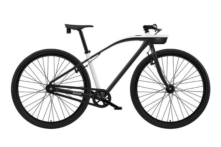


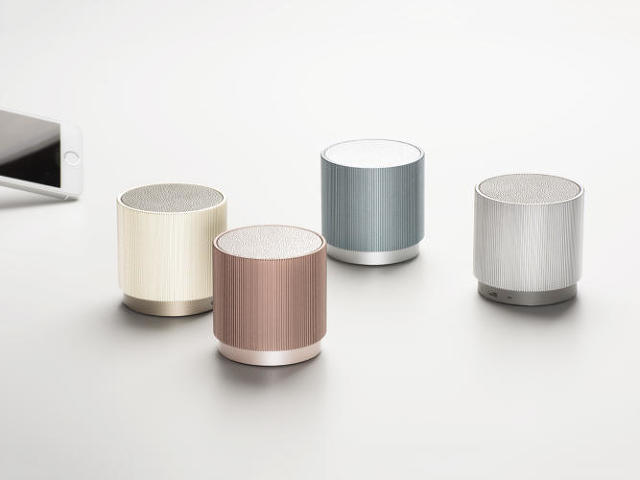


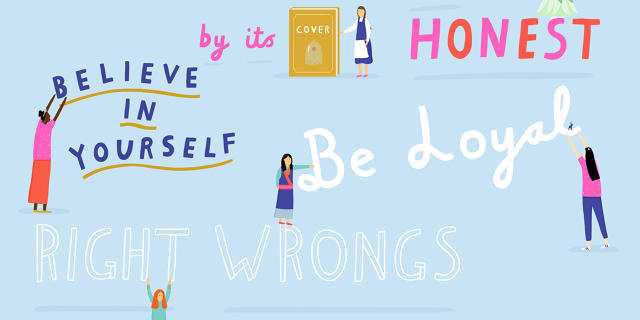
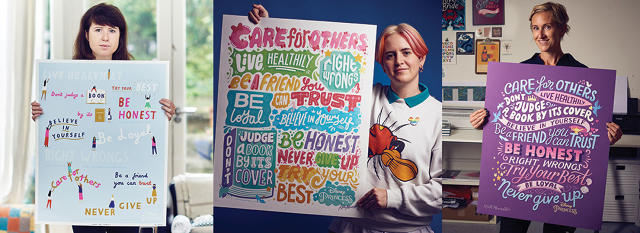
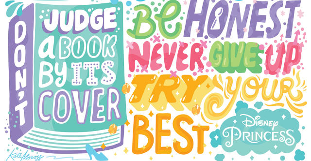


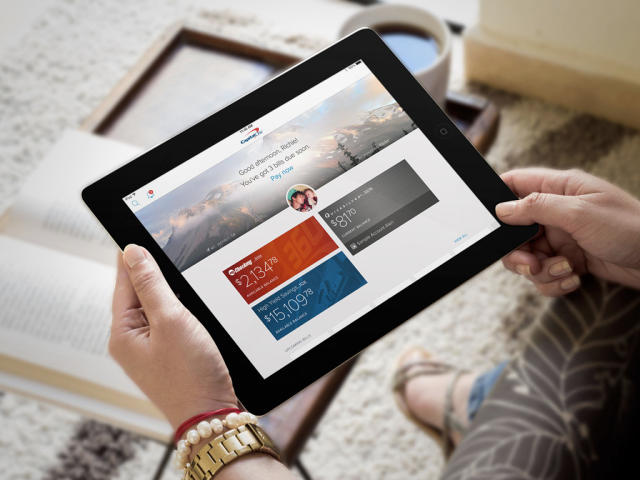


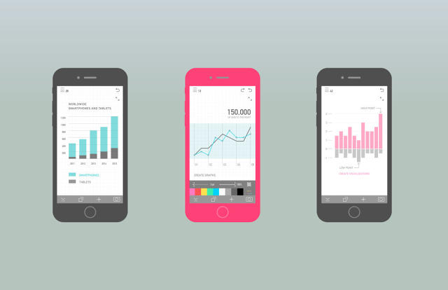

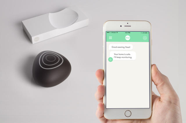


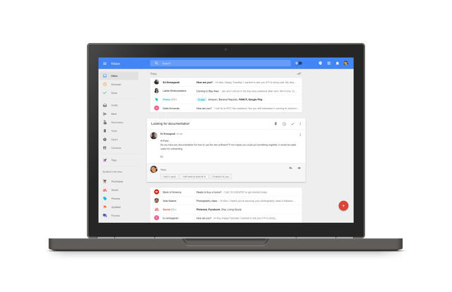


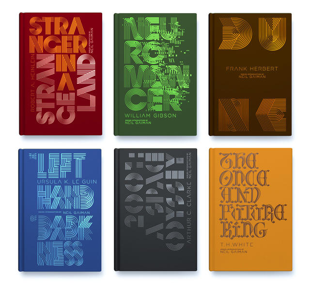


Comments
Post a Comment